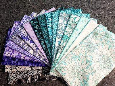
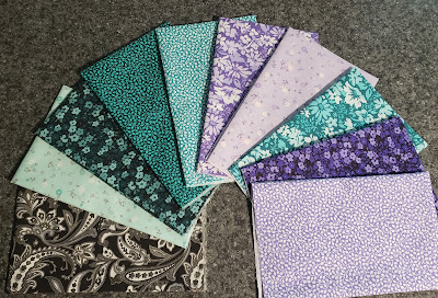
For my project, I opted to use fat quarters. Don't you just love this color combination? Purple is my favorite color and the teals really make things pop! I love the gradation from light to dark and black is the perfect accent color.
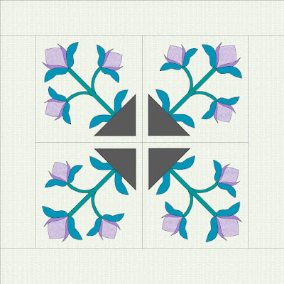
I think the hardest part was deciding what project that I wanted to make. I know, we all struggle with that somedays. When I'm designing patterns I tend to work in spurts and design a lot of patterns and then come back to them sometimes weeks, months or even years later with new fabric combinations. These images live in a file folder on my desktop aptly named "Designs Not Accepted" meaning that haven't been accepted for magazine or book publication. As I was looking through the images I came across this applique project that caught my eye. In my design software (EQ8), I did some tweaking and came up with this design.
My next step was to pull fabrics that would fit in each section of the design.
Since I really wanted to focus on the fabrics and the quilting with this project, I chose to use raw-edge fusible applique to make the piecing part quick and easy. I printed the motif and created template shapes to trace onto the fusible web with paper release. For this project I used Lite Steam-A-Seam 2 from The Warm Company.
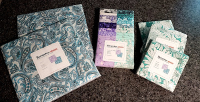
Essentially this project is a whole cloth applique quilt since there is no piecing of the background fabric. How about that for quick and easy? I started with a 42" x 42" piece of Benartex Color Weave in Light Gray which compliments perfectly with the Porch Swing collection.
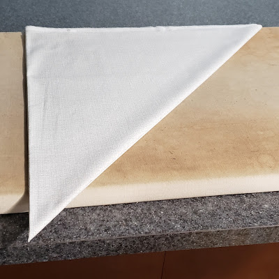
To get my orientation lines for the applique, I folded the fabric square in quarters and then on the diagonal and pressed all the fold lines. And yes, real life is happening here - my ironing board cover is looking pretty dingy!
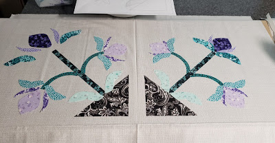
I then positioned all applique shapes in the appropriate places using my printed motif as a guide. The motif on the left shows how I sort the shapes into a general placement. On the right, you can see what the final placement looks like. When satisfied with the placement, then I iron them in place.
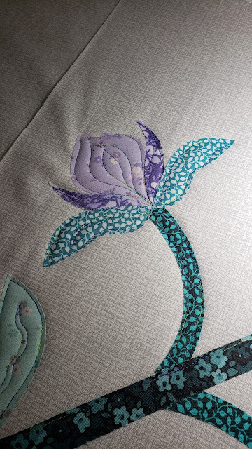
Next comes the fun part ... the quilting! For this project I skipped the step of securing the appliques with a machine blanket stitch or zig zag satin stitch. Instead I am using the longarm to stitch close to the edge of each shape while quilting. Talk about quick and easy!
I'm using a varigated thread in similiar colors to the collection and stitching less than 1/8" from the edge of each shape. I'm not striving for absolutely perfect stitch placement, rather I'm looking for an organic, natural appearance.
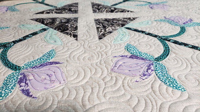
Next is the background fill ... something that truly makes my heart happy. I stitched a mix of swirls, echos and wavy lines to create a lot of movement all over the piece. The stitching is less than 1/2" apart so it lies very flat. To help with the flat look I used Warm 80/20 batting from The Warm Company. This batting gives perfect stitch definition without being bulky.
As I quilted around the appliques I adjusted the size of the quilting motifs to fit and balance with the shapes. To keep a monochromatic look, I used a white thread to quilt the background.
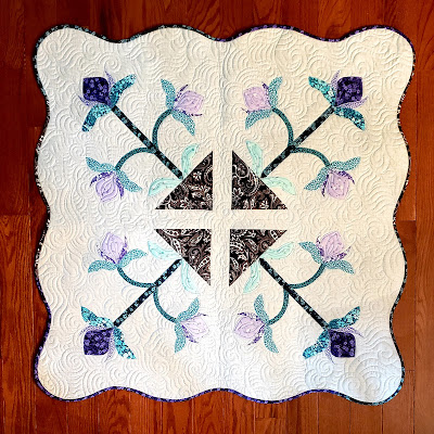
After the quilting was finished I trimmed the edges of the quilt, I had to make the decision whether to finish it as square or to do something special with the edges. Well, I rarely miss and opportunity to do something special so I decided to scallop the outer edges to give it a really fun look that contrasts with the harder lines of the applique. When I got it finished, I knew I had made the right decision.
I absolutely love all the movement the quilting created and the Porch Swing collection provided just the right amount of contrast to really make the design pop. I can't wait to see what you make with this collection.
So if you have been paying attention, I've been referring to this as a "project" not a wall hanging or a table topper. I'm undecided on how to use it. Can you help me out? Leave a comment and let me know if you would use it as a wall hanging or a table topper.

.jpg)
